An open and diverse society needs people who courageously shape their environment. Stiftung Bürgermut is a platform and community. The foundation supports committed people and initiatives to become more effective. It qualifies and networks. It helps civil society projects to grow.
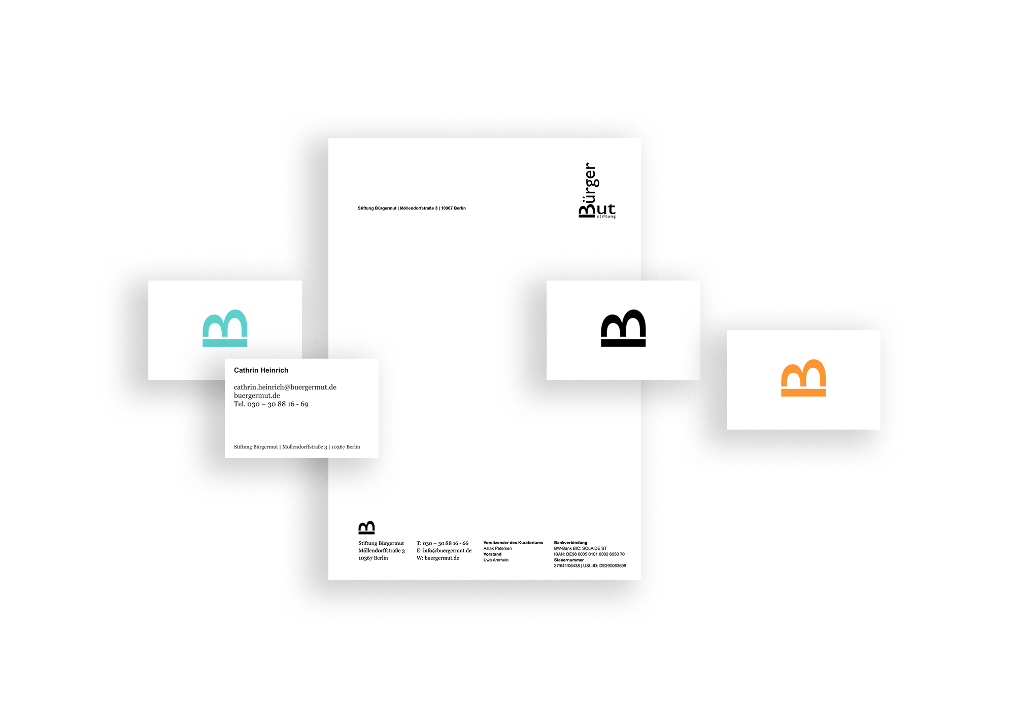
In addition to the existing logo, which was not to be changed, the submark (flipped B), now takes a prominent role in the foundation´s identity.
The team can choose from three versions of the new business cards and select their personal favourite tone from the new corporate colours. The letterhead remains restrained and functional in black and white.
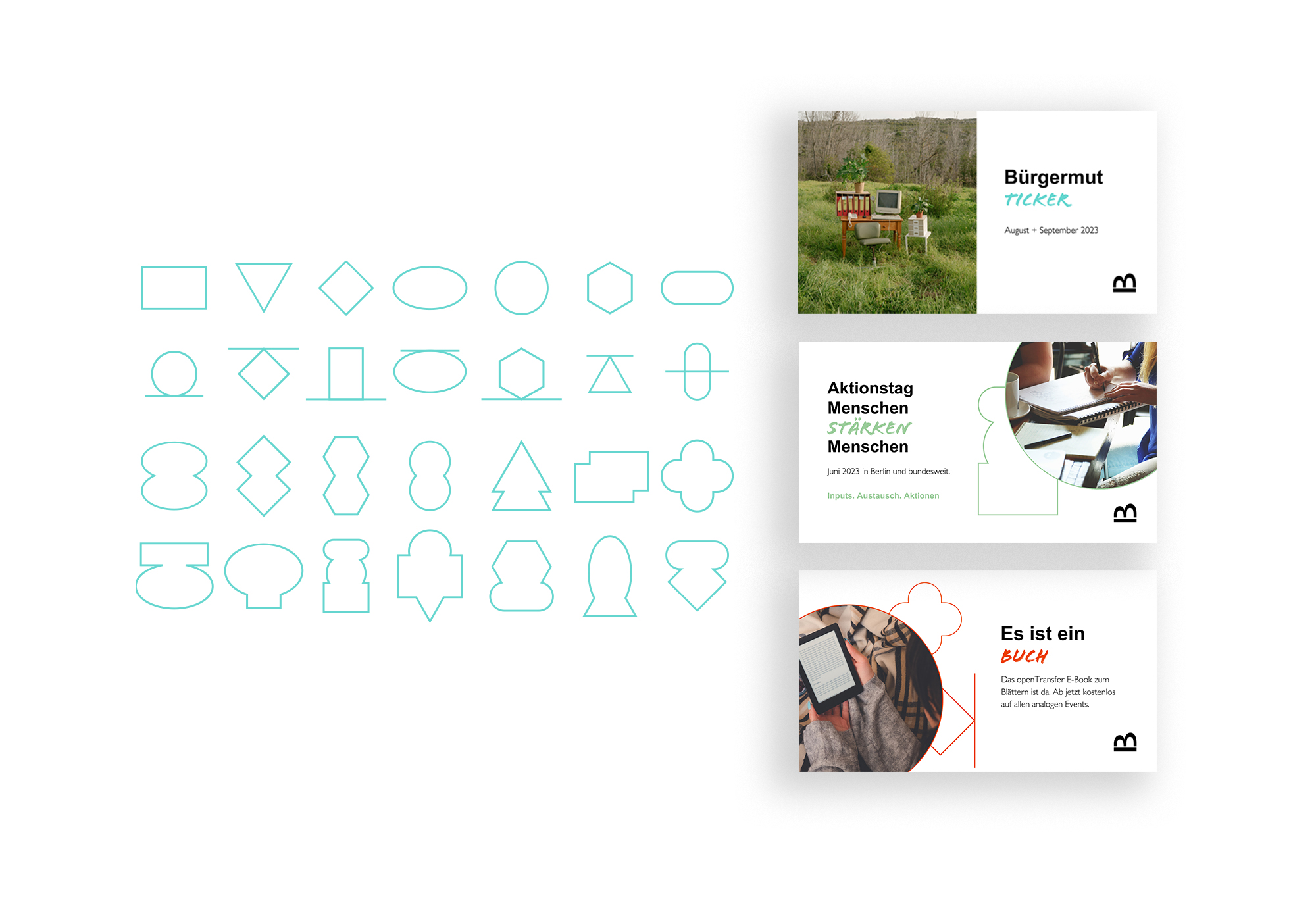
I designed the set of 28 shapes to create a visual bracket for the use of photos and graphics. The shapes allow designers and also the foundation’s team to experiment and create something new. They can be filled with color accents or photos and arranged freely each time. This process is emblematic of the foundation’s work: experimentation, development, dynamism, progress, interplay, innovation, tension.
The project teams can also work freely with the geometric shapes on the social media templates for LinkedIn. The typography and the basic structure follow clear rules and the colour scheme encodes the corresponding sub-programme of the Stiftung Bürgermut.
The new website presents the exciting fields of work of Stiftung Bürgermut , explains methods and formats and provides information on numerous events and publications.